Colours play an important role in shaping the mood and energy of a space. According to Vastu Shastra, the colours used in your bedroom can directly influence your sleep quality, emotions, and overall well-being.
This is why many people ask—which colour bedsheet is good as per vastu?
Bedsheets are one of the most visible elements in a bedroom, and their colour can either create a calming environment or disturb the balance of energy. Choosing the right colour helps promote relaxation, positivity, and better sleep.
In this guide, you’ll learn which colours work best as per vastu and how to choose the right bedsheet for your bedroom.
Understanding Vastu Principles for Bedroom Colours
Vastu Shastra focuses on creating harmony between your living space and natural energy forces. In the bedroom, this harmony is especially important because it is a place of rest and recovery.
Colours are believed to influence energy flow and emotional balance. Soft, soothing colours promote calmness, while very bright or dark shades can create restlessness or heaviness.
The goal of vastu in bedroom design is to create a space that feels peaceful, balanced, and comfortable. This is why lighter and natural tones are generally preferred.
Choosing the right bedsheet colour is not just about aesthetics—it’s about creating an environment that supports relaxation and mental clarity.
Why Colours Impact Energy and Sleep
Colours have a psychological effect on the mind.
For example, shades like blue and green are known to reduce stress and promote calmness, while strong colours like red can increase alertness. Vastu aligns with this idea by recommending colours that support rest and emotional balance in the bedroom.
Ideal Bedroom Energy as per Vastu
As per vastu, the bedroom should feel calm, stable, and free from excessive stimulation.
This means avoiding colours that are too loud or intense. Instead, soft tones that create a sense of comfort and relaxation are ideal. The overall aim is to create a space that supports restful sleep and positive energy.
Which Colour Bedsheet Is Good as per Vastu?
When it comes to choosing bedsheet colours, vastu recommends shades that promote peace, balance, and positivity.
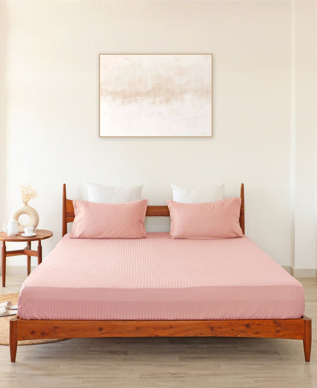
Light and natural colours are generally the safest and most effective choices. These colours help create a soothing environment and improve the overall energy of the bedroom.
White & Off-White Bedsheets
White and off-white are considered the most vastu-friendly colours.
They symbolize purity, clarity, and simplicity. These shades make the room feel clean and spacious while promoting a sense of calm. White bedsheets are especially suitable for creating a peaceful sleeping environment.
Light Blue Bedsheets
Light blue is associated with calmness and relaxation.
It helps reduce stress and supports better sleep, making it an excellent choice for bedrooms. Blue tones are often recommended for people who experience restlessness or have difficulty unwinding after a long day.
Light Green Bedsheets
Light green represents freshness, healing, and balance.
It brings a natural and refreshing feel to the bedroom while promoting emotional stability. Green shades are particularly beneficial for creating a relaxing and rejuvenating environment.
Colours to Avoid in Bedsheets as per Vastu
While choosing the right colours is important, avoiding certain shades is equally essential for maintaining a balanced bedroom environment.
Dark and overly intense colours are generally not recommended in vastu for sleeping spaces. These shades can create a heavy or unsettling atmosphere, which may affect relaxation and sleep quality.
Similarly, very bright or neon colours can overstimulate the mind and make it harder to unwind at night.
The idea is to keep the bedroom calm and soothing rather than visually overpowering.
Dark Red & Black Bedsheets
Dark red and black are considered strong and intense colours.
While red is associated with energy and passion, darker shades can feel overpowered in a bedroom setting. Black, on the other hand, may create a heavy or dull atmosphere.
Using these colours frequently in bedsheets may disturb the calming energy that is essential for good sleep.
Very Bright or Neon Colours
Bright and neon colours can be visually stimulating.
While they may look attractive, they are not ideal for a restful environment. Such colours can create mental alertness rather than relaxation, which may interfere with sleep quality.
For bedrooms, softer and muted tones are always a better choice.
How to Choose Bedsheet Colour Based on Bedroom Direction
Vastu also considers the direction of your bedroom when suggesting suitable colours.
Different directions are associated with different energy elements, and choosing bedsheet colours accordingly can enhance balance in the space.
For example, bedrooms facing east are often associated with freshness and positivity, while west-facing rooms may benefit from calming tones.
Instead of choosing colours randomly, aligning them with the room’s direction can help create a more harmonious environment.
It’s also important to ensure that the bedsheet colour complements the overall room décor, including wall colours and furniture, to maintain visual and energetic balance.
Direction-Based Colour Suggestions
Here are some simple vastu-based suggestions:
- East-facing bedroom → Light green or beige for freshness
- West-facing bedroom → White or light blue for calmness
- North-facing bedroom → Green or pastel shades for balance
- South-facing bedroom → Soft earthy tones for stability
These combinations help align the bedroom with natural energy flow.
Matching Bedsheet with Wall & Room Theme
Bedsheet colour should not clash with the room’s overall design.
Choosing shades that complement wall colours and furniture creates a more balanced and visually pleasing space. Soft, coordinated colours enhance both aesthetics and vastu alignment, making the room feel more peaceful and inviting.
Common Mistakes to Avoid While Choosing Bedsheet Colours
One common mistake is choosing bedsheet colours based only on trends or appearance without considering comfort and usability.
Another mistake is ignoring lighting conditions. A colour that looks good in bright light may appear dull or heavy in low lighting.
Overusing dark or overly bright colours can also disrupt the calm atmosphere needed in a bedroom.
Lastly, not coordinating bedsheet colours with the overall room design can make the space feel unbalanced.
Avoiding these mistakes helps create a bedroom that is both visually appealing and aligned with vastu principles.
Final Thoughts
As per Vastu experts, light and soothing colours like white, blue, and green are generally the best choices, as they promote relaxation and positive energy.
By thoughtfully choosing the right bedsheet colour, you can improve both the look of your bedroom and the quality of your sleep.